Written by Steve Morris
On
In Project Updates
Tagged comic book, fantasy, golden age, Graphic Novel, Steve Morris, steven james morris, verboten
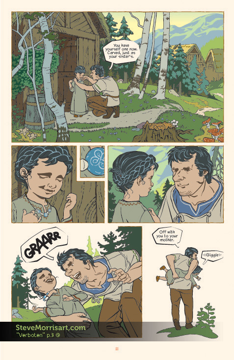
"Verboten" graphic novel, page 3
 I converted another page of my GN "Verboten" from the Butterbroda style to this more colorful style. I haven't yet applied the Photoshop gradients, like I have for the first page...which will help add depth and atmosphere. Converting a page from the old style to the new, is more time consuming that I thought it would be, because of the time it takes to muddle through the Illustrator file...I'll be curious to see how long a page takes once I start new pages. Working on the pages in the Butterbroda style was like assembling a jigsaw puzzle because the limited color pallet greatly restricts how shapes can overlap and be placed, it's nice to be freed from that.
The Bouncer
 For anyone interested in wild west centric comics or really beautiful art, check out The Bouncer by Alexandro Jodorowsky and Francois Boucq. The graphic novel series is comprised of two large format books centered around betrayals, murder and greed. I originally picked them up years ago because I was really taken in by Francois Boucq's sweeping illustrations. I don't think I've ever seen an artist with such a cinematic feel to their work. Not only are his landscape expansive, but even his indoor scenes can take on a larger-than-life dimension, while making the reader feel as though they are right in the middle of the action. The story itself will keep you engaged and its often brutal vision of life in the Old West will certainly make you think twice about longing for those simpler days.
Graphic Novel Art
 This has been in the works for a while, or rather was started a while back but progress has come to a stand still because of other projects and work. Above is the first page of a very long Graphic Novel I wrote, set in Medieval Northern Europe. I originally planned on doing the GN in my Butterbroda style because it fit the subject matter, and a simple style would speed up the drawing process...although that style is deceptive and takes more work than even I seem to realize sometimes.
I completed the first four pages, but the general consensus said it wouldn't work over an entire book. I was really determined to make the style work, but admittedly wasn't really sure myself, that it would hold up over 300 pages...so after allot of mental ping pong I went in the direction of the image above...a mix of Butterbroda with some Russian and Japanese influences added.
The desire to use the Butterbroda style was fulfilled when I started the print series...and any lingering heistation about using the more rendered style for the GN dissipated. Now I just need to get on with it...


