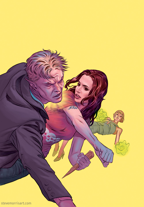
Written by Steve Morris
On
In Project Updates
Tagged Fight Club 2, Fight Club, art, comic cover, comic art, steve morris
Final-ish Self-Portrait Painting
self-portrait 2014, acrylic on paper mounted panel. 18"x24"
Detail of painting.
This is the final painting for a life-size self-portrait I started in late 2013. These photographs of the painting are ones I took, but I'll eventually have it professionally photographed. There are a couple of places I'll touch up, but I think it's 99.9% finished...seeing work in a photo always highlights problems, but photos (at least the ones I took) seem to make the painting look a harsher than it does to the naked eye.
I don't normally paint on paper mounted panels, but it was an experiment. In the future, I'm going back to my standard use of panels without the paper. Acrylics sometimes form unwanted textures, and in this painting I overworked the glazing medium early on, which created pock marked areas. I was concerned about abrading the surface of the paper so I didn't sand the pocked areas until much later on, but it was essential too late to get rid of the texture by that point.
I think I may have spent as much time on the background as I did on the face. I usually paint whatever exist behind the subject, but in this case, the walls of the bathroom were creating some bad compositional lines, so I needed to shift where the walls sat. I added the towel (after several experiments) to fill the large open area and balance the negative space around my head. A fun fact: the towel is a ancient Dungeons & Dragons beach towel from the early 1980's.
The manner in which I painted this was a departure from my normal dry-brushing. Also, I didn't blend as much, leaving some paint stoke visibility, to get away from an overly smoothed effect. Golden's glazing medium is definitely the way to go to allow wet-on-wet blending (it as retarder in it), which is normally difficult with acrylics unless you use fluid acrylics or a lot of water. The glazing medium also facilitated visual blending, by using translucent layers of paint over dry areas and made it much easier to intensify areas of color, without having to repaint.
Butterbroda Pig Roast
This is a new piece from my Butterbroda series.
Titled: "The Feast We Made of Us"
Size: 30"x20"
I introduced a couple of new colors, beyond the additions, which I had used on the Alice in Wonderland piece. I tried a green for the apple and lettuce, but decided to stick with the blue and red, green somehow felt too far outside the color space. While adding more colors frees me up a bit in the way shapes can overlap, it also requires some use of outlines, which I rarely used for colored shapes.
Painting on the floor
This is a 12+ years old self portrait, that needed a some finishing and fixing...at this point the main part that needs to be cleaned up is the shirt. I'm using the foil to protect the painting surface from hand oils.
I've always painted on the floor, mainly because I like to spread out, but also because I want quick access to all my paint tubes, due to the fast drying acrylics on the pallet. I decided to crack open my unused liquid acrylics along with my tubes. I've never used fluid acrylics for painting, but they definitely make life easier in some cases...they do dry-up really fast though, in comparison to the Winsor & Newton tubes, which have some retarder mixed in with them.
New sequential art
So this happened over the weekend...

This is for a story I wrote in 2006. I wanted to use a new style, and had experimented some but never got past that stage. Recently, I started working on the story again and came to the conclusion that I would be better off partnering with an artist (other than myself). I came to this conclusion mainly because I thought it was better time management...but in the last week the control freak in me began surfacing so I start to experiment again with the newish style. Once I had done a few pieces, I made an impromptu dive into the art for page one. Part of me would prefer the style to be more exaggerated, a little less real, but this direction seems to be working so any alterations will likely be small. I also have a page two which is almost done.
Alice in Wonderland
New Alice in Wonderland piece, for my "Butterbroda" series.
Cover for Buffy the Vampire Slayer season 10 issue 2
I originally pitched this cover as a more simple version, with the Scoobies standing in a mall parking lot and looking into a sunrise. DH wanted a little more bang to it, mentioning the ending scene of The Avengers. So this is my version of that scene, with the battle worn gang, taking a quick donut break, while menace encroaches.
Dawn started with wilder eyes, but DH felt she looked too "donut crazy," which was the angle I was going for, but I altered them for a less sugar crazed look.
I'm still getting used to drawing young Giles, I made his hair a little too moppy...he developed an unintentional Eric Forman thing, between the clothing and the hair.
Spike Graphic Novel
My cover for an upcoming “Spike” graphic novel, written by James Marsters, and published by Dark Horse. There’s an interview with James on i09 here.
The Occultist issue 5 cover
Due out in February 2014.
Starting to paint again
Over the last ten years I’ve painted very little, only a few animal portraits and nothing else. I’ve had new paint and panels sitting around the last couple of years, with the intention of diving back in…it just took a while to get there.
Before I get moving full force, I thought I’d warmup with a self portrait. Traditionally, I dry-brush large portions of my paintings…but paint, mediums, and retarders have come a long way, so I’m trying to work the paint more like oils…it’s producing pretty good results so far.
This is part of the self portrait which I’m currently working on. The head is life size. The weather hasn’t been cooperating, so I’ve been spending more time working on the left side of my face, and will pick back up on the right side when I have stronger light from the window. Winsor & Newton glazing medium has proven to be very useful for blending and tinting…far better than using water, or regular medium.
I made a minor wrong-turn a few days ago when I impulively decided to dramatically change the lighting. An hour into darkening the left side of my face, I realized a made a mistake, and spent the rest of the day repainting and reclaiming what I had covered up.
The Occultist cover #3 of 5
 I've included the sketch below.

The Occultist issue 2 of 5

The Occultist #2 of 5, for November 2013.
With this second cover I started to hit my stride on this series. I veered towards stylization, which lends itself better to the costume and subject matter, rather than the more realistic rendering I had used previously.
Sphinx I series sketch
 Sketch on bond paper, 8"x10", title: "Speed Yer Head."
This is the final graphite sketch for the piece. I'll do some test renderings on scrap paper before I move onto the final piece. I plan on blocking in the background with graphite power to keep the wisteria soft...another element I'll need to practice on scrap first.
Sketch on bond paper, 8"x10", title: "Speed Yer Head."
This is the final graphite sketch for the piece. I'll do some test renderings on scrap paper before I move onto the final piece. I plan on blocking in the background with graphite power to keep the wisteria soft...another element I'll need to practice on scrap first.

Above is the initial digital sketch. I first drew it digitally so I could more easily play with the scale ( I probably should have made it bigger). I printed the image and then lightboxed it onto the bond paper.

These were some scrap paper tests for the design of the masonry. I only decided on this more complicated design after I was close to finishing the graphite sketch. It's one of the reasons the piece could have stood to be bigger, but I'll just stick with mechanical pencils for the smaller details and rendering...and maybe a magnifying glass.
I also post this personal work, in a stripped down version, on my second tumblr »
New Butterbroda piece
 Title: "Restraint, as Yet Unpracticed”
I haven't done a new Butterbroda piece in months, but I decided to jump back in. I also have had an upcoming licensing opportunity which I'll post more about soon.