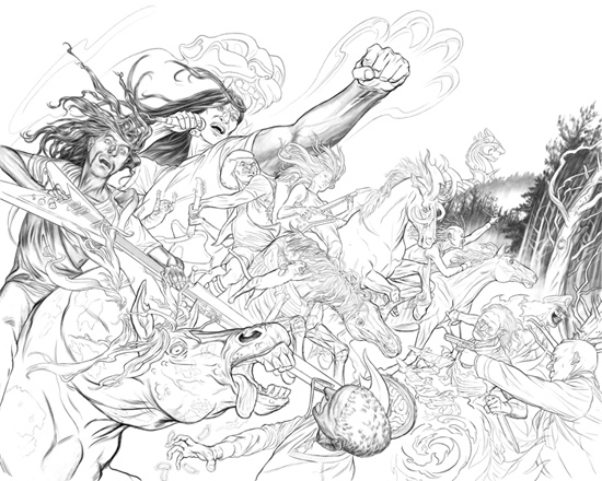
 I'm finally back to working on my personal projects. This is the final drawing with the altered horses and various touch-ups, I'll start on the coloring from here and do any other altering during that stage. I did a minimal amount of shading to the figures, since this piece, unlike the gripping beast picture, is less about dense rendering and more about the overall flow.
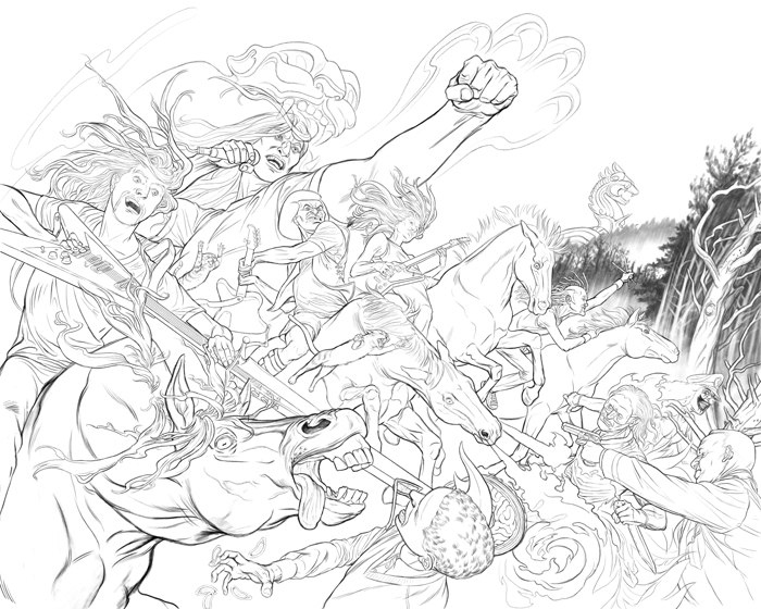
Another update, about 10% remaining to do to the drawing, most of which is editing the horses to reflect famine, death, pestilence and war imagery of the four horsemen. Click image above for larger version.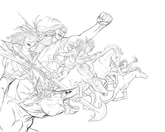
I've gotten all the main Dethklok characters drawn, next I'll start working on all the peripheral imagery as well as tweaking the existing line work.
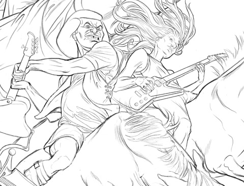
Above is a close up...I just noticed that I forgot Skwisgaar's guitar strap. I also need to print it out to get an idea of the scale and whether any more detail is needed.
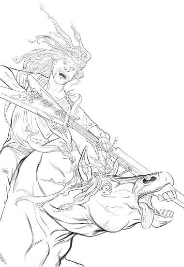
This is the first section of finished pencils from the Dethklok sketch, specifically the lower left corner, which is Toki. I plan on doing extra shading later on, once I'm sure that all the parts of the picture are where I want them to be. This part of the drawing will probably be the hardest part bc of the unusual angle on the horse and the guitar...the rest of the drawing is more straight forward though, and I'll hopefully burn through it faster. I'll be adding all future updates, for this drawing, within this post.
See the final art here.
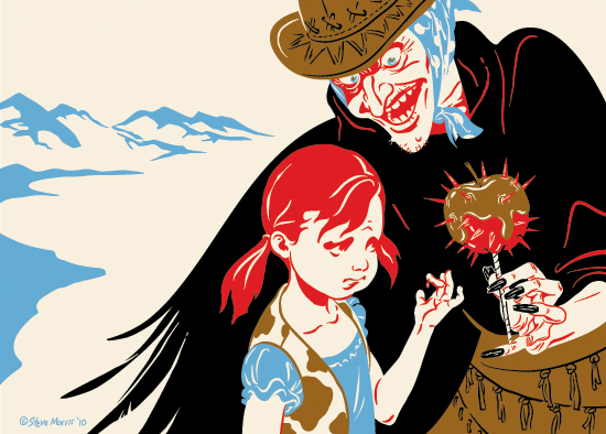
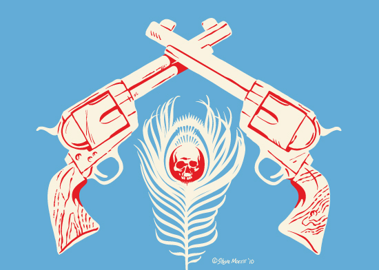
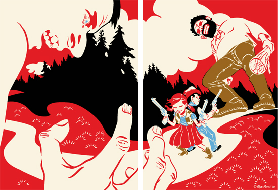
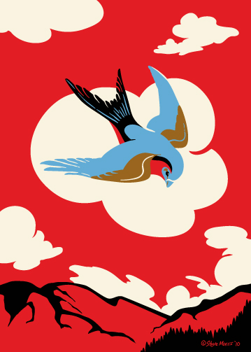 I flipped the colors on this one, it started with the lighter pallet , but I felt it was getting a little lost...at least in the present composition. This is part of the "Westerly Strut" sub-series, but it could really go with Butterbroda "proper" as well. On a side note, I've started to color the "Felled" drawing, it still has along ways to go, but will post the WIP soon.
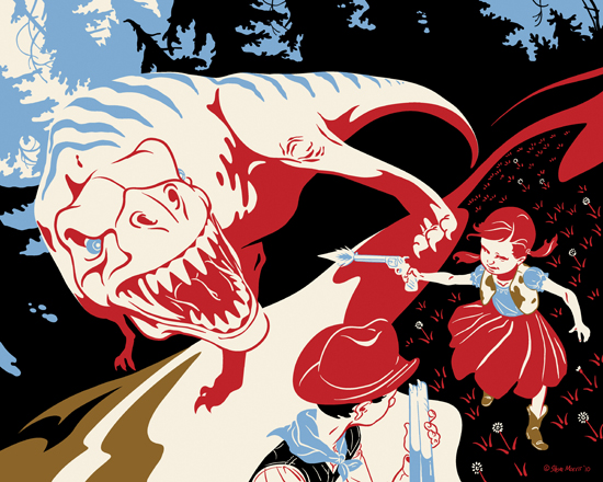




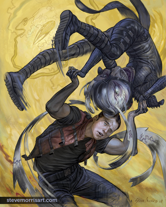
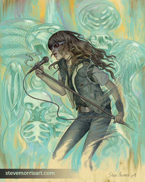

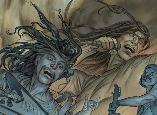

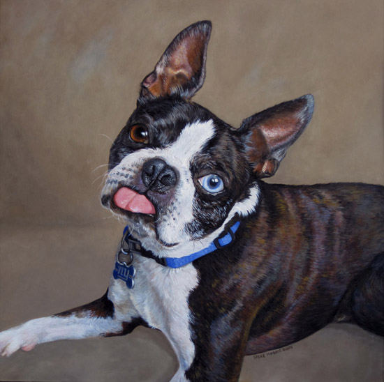


 I was planning on coloring one of my older drawings this past weekend, but then an idea came to mind and I started this Dethklok pict. For anyone unaware,
 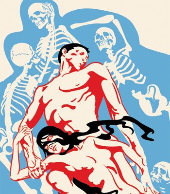 The above detail was started a while back and is very much unfinished...I open it up from time to time to fiddle, adjust and move it forward. Paolo & Francesca are characters (as well as historical figures) in Dante's Inferno. The couple inhabit a whirlwind of souls condemned for their carnal lust. I don't specifically remember why I started this image, but I imagine I came a cross one of the many painted renditions of the subject during some random net surfing. I may tone down the skeletons, by either simplifying them or stylizing them...or both.
 This has been in the works for a while, or rather was started a while back but progress has come to a stand still because of other projects and work. Above is the first page of a very long Graphic Novel I wrote, set in Medieval Northern Europe. I originally planned on doing the GN in my Butterbroda style because it fit the subject matter, and a simple style would speed up the drawing process...although that style is deceptive and takes more work than even I seem to realize sometimes.
 This is the final colored gripping beast picture. The full size is 18"x18" at 600DPI, it was a good thing I bought this new machine, my old Mac wouldn't have been cable of handle this large of a file. I'm debating if I need to add some more highlights to the skeletons in the beast's body but I want to see some test prints before I do any more.
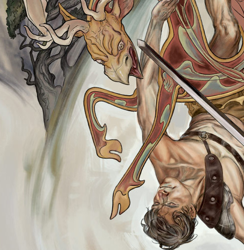 I've finally gotten around to the coloring process on the older drawings I did. This is a part of the Gripping Best image. I'm still experimenting some with the color but the overall I've been happy with the painting effect that I've been able to make in PS. The beast itself has the most work left on it. I changed some small parts of the background for better flow to the picture.